The business aims to design a new mobile app for their existing customers, providing them with secure and comprehensive control over their online accounts. This app will streamline access to services, allowing customers to save time by eliminating the need to visit the shop for loan renewals.
Currently, customers can only renew live pawnbroker loans through a basic, limited-option form on the website, which was created during the COVID-19 pandemic. The new app will enhance this experience by offering additional features and greater convenience.
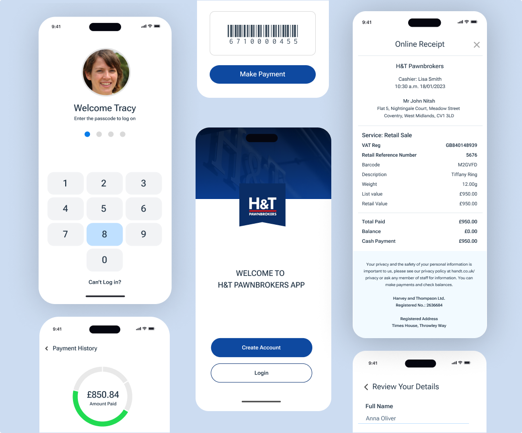
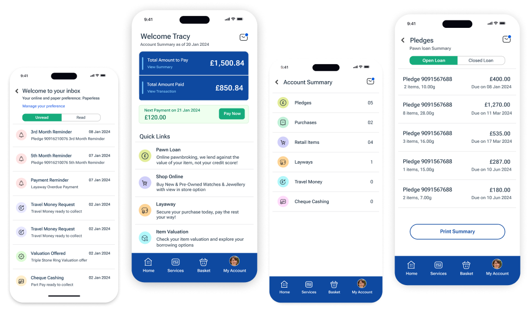
With the new mobile app, customers will be able to access their accounts online, view their pledges, renew them, and pay for their pickup loans and layaway items. Additionally, the business aims to transition to digital communication, moving towards a paperless system.
UI/UX Designer
User Research, User Interview Concept development, User Personas, Empathy Maps, Information Architecture, Prototyping
2024
Design Thinking exploration to simplify the complex process
I conducted user research and interviews to identify user goals and various pain points in their journeys. One significant pain point was the need to display total dues from various services with different interest rates in a simplified and easy-to-understand manner, especially for users who are not very tech-savvy. Additionally, some services, like pawn loans, involve paying money to the user, while others, like layaway, involve taking money from the user.
Pawned items often have emotional value, so we aimed to make it easy for users to self-serve and manage their accounts through the app. This way, they can pay their pawn loans on time, avoid unnecessary interest, and prevent their items from going to auction.
Based on my research, I identified 3 user types in our interviews: active user, passive user, business user. I chose to focus on creating a solution for active user. By addressing active user frustrations, I aimed to design an user-friendly and easy to navigate user journey.
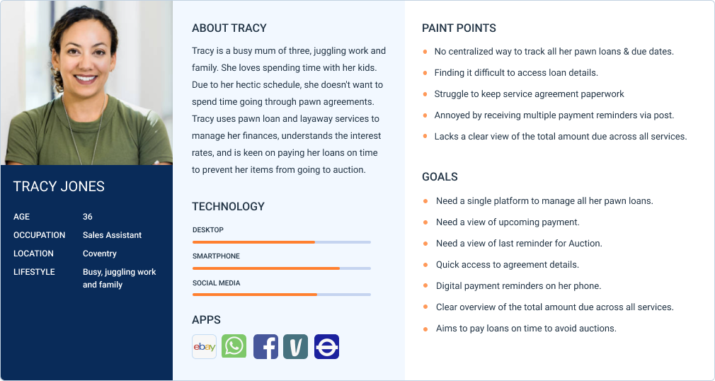
To gain a deeper understanding of potential pain points from an active user's perspective, I created a user journey map. This exercise helped me to empathise with the user's feelings and identify potential pain points throughout the process. By viewing the experience from the user's perspective, I pinpointed key areas for improvement in our solution, ensuring a smoother and more user-friendly application. Our aim was to create an app that was easy to navigate and made users feel in control.
We started with whiteboard discussions, followed by the creation of paper wireframes to identify all necessary elements. We also developed a low-fidelity prototype to quickly test and validate our design concepts. Based on the feedback received, I updated the wireframes, prototypes, and user flows accordingly, while ensuring that the wider team remained informed and involved throughout the process.
The objective of the testing was to identify any issues with the user journey and the app's look and feel, as well as to identify opportunities for design improvements by observing how participants interact with the prototype's features.